Be My Eyes Design Iteration
What is Be My Eyes?
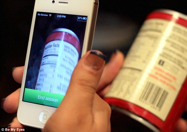
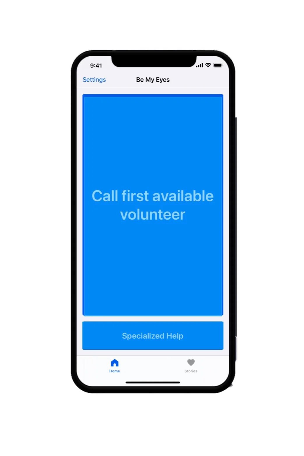
The Be My Eyes application pairs users who are blind with sighted volunteers to quickly identify objects, help with directions, colors, and more. While this allows users who are blind to live independantly, are users' needs truly being met with this application? How learnable and usable is the application in peoples daily lives?Problem Space Overview:
Over the course of eight weeks in our Accessibility Design class, my group of four sought to explore what iterations could be made to make Be My Eyes even more robust and useful to their target user. Utilizing observations and interviews we were able to iterate on design features and conduct usability testing to answer our research question:How can Be My Eyes better service users who are blind, and increase their presence as an assistive technology?
How can Be My Eyes better service users who are blind, and increase their presence as an assistive technology?
Role:
Phase 1: UX Researcher: Conducted interviews, analyzed results, contributed to the final paper Phase 2: UX Design: Created sketches, low-fi prototype and conducted testingSolution:
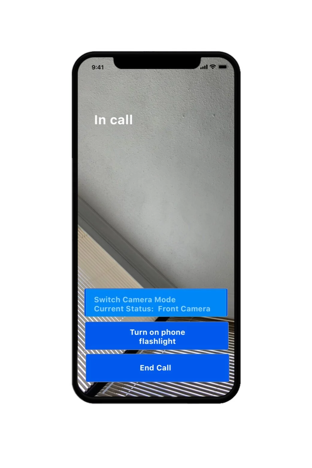
We discovered new specialized features for use cases including:- Alerting the user which camera is displaying
- Incorporating a flashlight to assist the sited volunteer’s view of video output
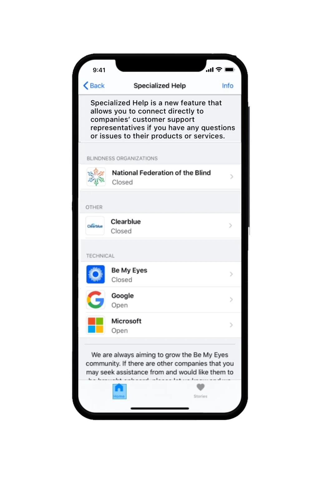
- Editing the language of the Specialized Help section to increase understanding of its features
- The particiant felt the camera and flashlight features were the most useful
- The feature of “filtering a volunteer” for the duration of time needed may be unnecessary and if used should include an “I don’t know” option
- Adding this new functionality can improve on the usefulness of Be My Eyes and ensure that Be My Eyes is even more successful in the assistive technology space.
Process:
1.Research
Inquiry-
To learn about the experience and concerns of our target users we recruited participants who were:- Completely blind
- Owned a smart phone
- Used a screen reader on that smart phone
- Never used Be My Eyes OR used it less than twice a week
- An observation of the participants downloading and/ or familiarizing themselves with the application
- A scenario- based observation in which the participant had to identify two candy-bars using the Be My Eyes application and volunteer
- Participants using the application on their own for a period of three days followed by an interview about their experiences on the fourth day
2.Analysis and Findings
Data Analysis
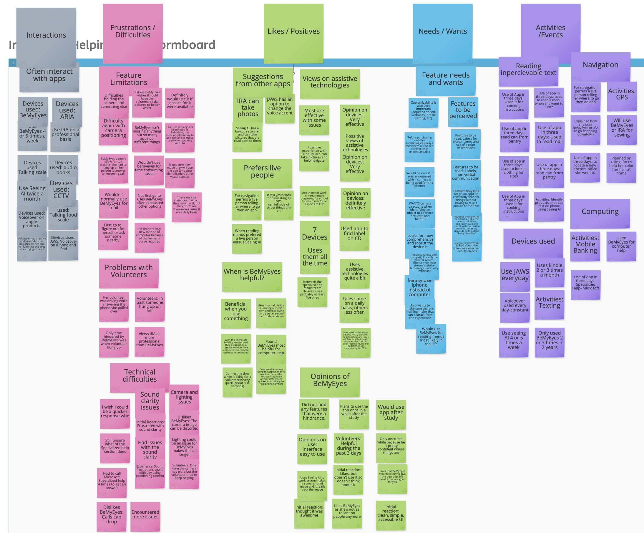
We analyzed the descriptive observations and interviews separately using open inductive coding on Atlas.ti software. These codes were then compiled in an online affinity diagramming tool (Stormboard). We organized our codes into common and salient categories and then translated those categories into design guidelines.Main Findings
- Provide hands-free options such as syncing the application to a camera mount on cane, or camera lens glasses.
- Enable directional use when positioning the camera when item is not in range.
- When appropriate allow Be My Eyes to have the option to turn on camera light.
- Allow the user to filter a volunteer for the duration of time needed.
- Provide detailed accessibility customization settings.
- Warn user when connected, and which camera is being used.
- Improve sound clarity and connection reliability
3.Design
Sketching
To keep the iteration in scope with my timeline of 6 weeks, I focused on 4 of the 8 improvements which were:
· Allow Be My Eyes to have the option to turn on camera light
· Allow the user to filter a volunteer for the duration of time needed
· Provide detailed explanation of the Specialized Help section
· Warn user which camera is being used and have the ability to switch the camera in app
The initial phases of the redesign demanded thoughtful consideration on both the interaction design and designing with accessibility guidelines in mind. This included guidelines such has the POUR acronym (Perceive, Operable, Understandable, and Robust), keeping the language as simple as possible and remembering to design with screen readers in mind.
Low fi prototyping
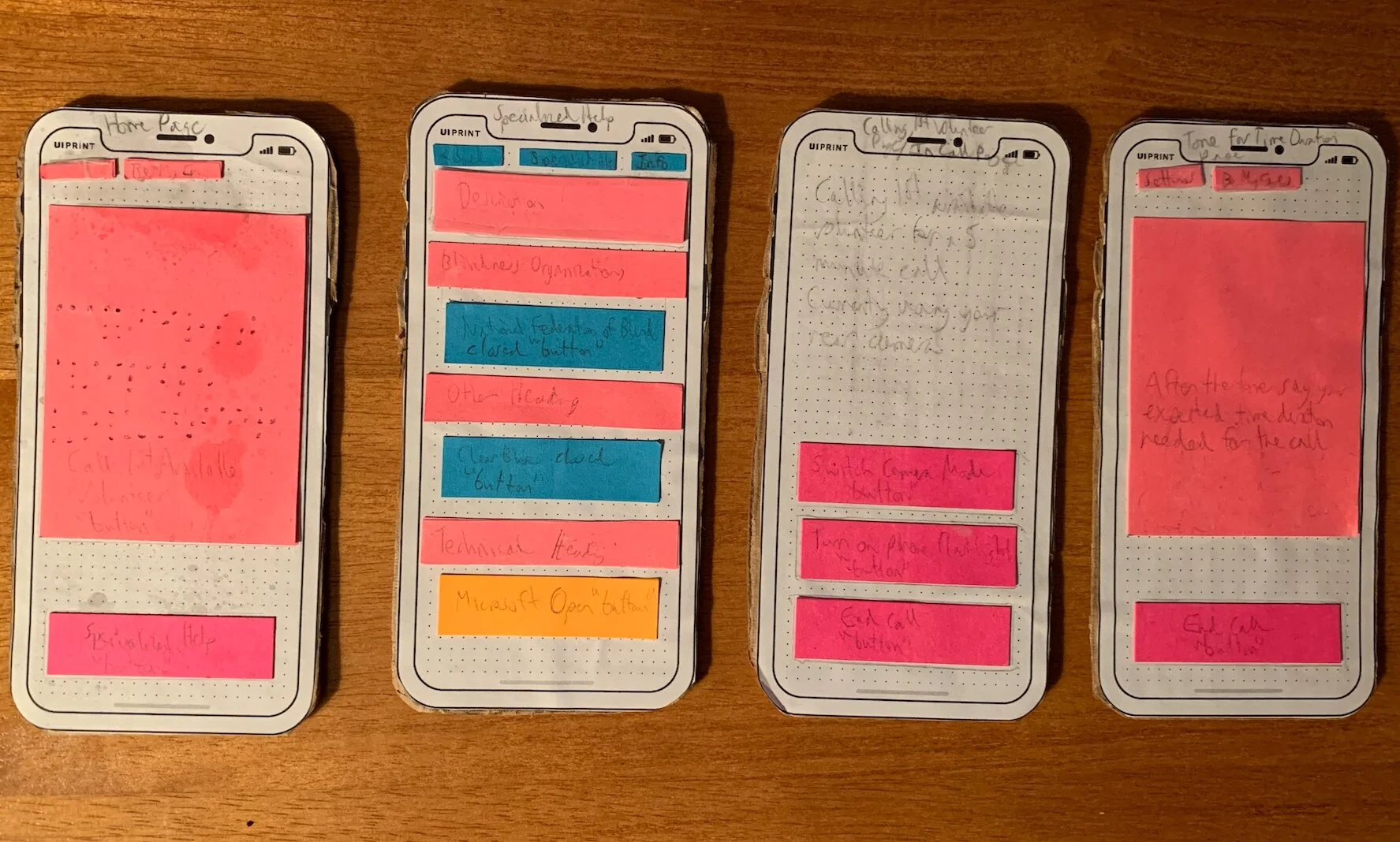
One of the biggest challenges was determining how to make the prototype perceivable to the person in the user test. The best prototype was creating a wizard of oz and low fidelity prototype hybrid.
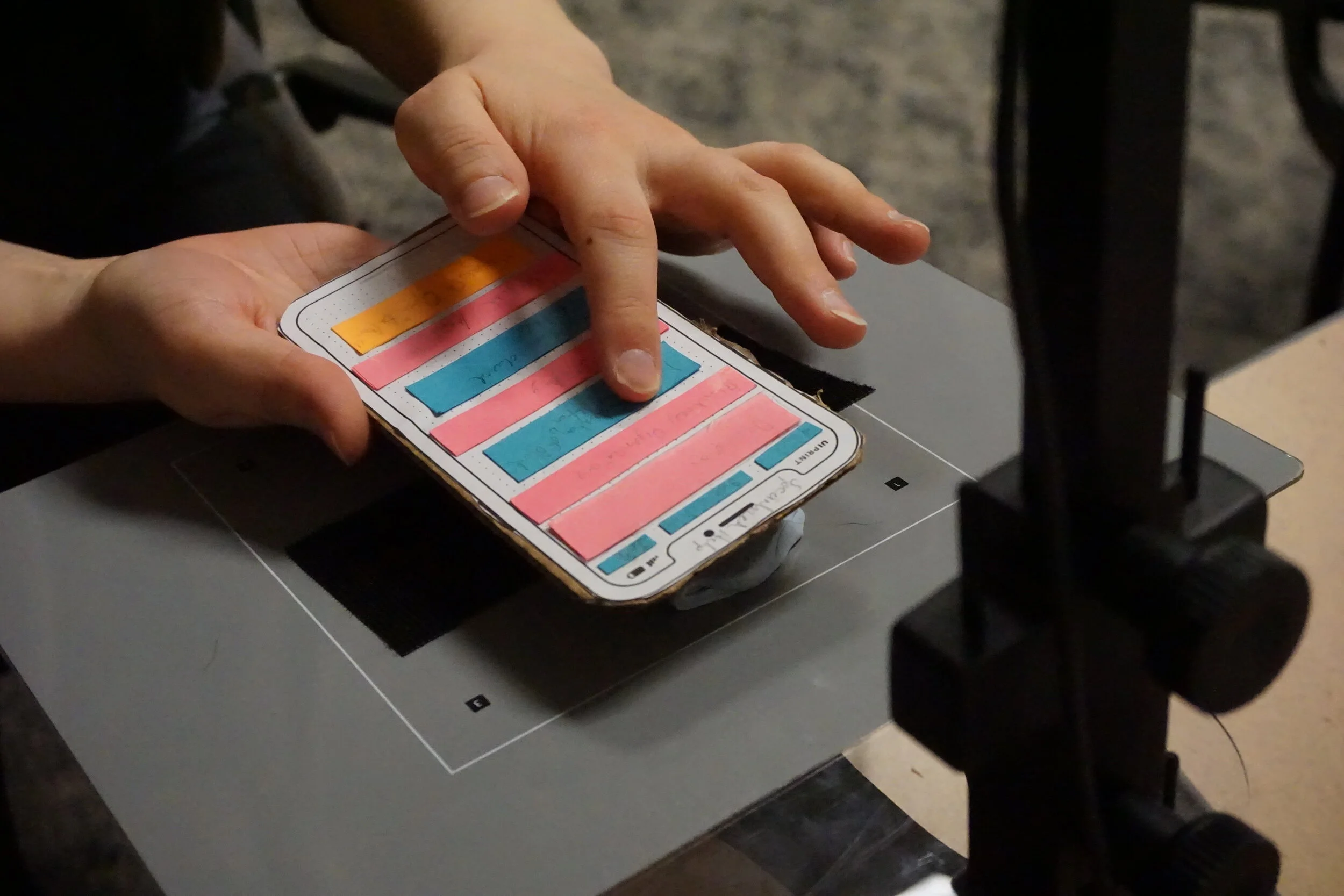
The physical phone was a simple cardboard cutout in the shape of an iPhone and the buttons that contained the interactions would be raised stacks of post-it notes so the user could have the tactile experience of a button. My voice acted as the VoiceOver assistant. Whenever they would pass over a button with their fingers, I would read the button capabilities much like Voiceover scan would.
4.Testing
Test Results
Success was defined if the user was able to find the added feature and act on it to complete the task. The insights gained from the testing are as follows:
The user had a 100% success rate
The user found it awkward to get used to the paper prototype
The user found the camera switch and flashlight to be the most beneficial features
Selecting the allotted time may be better if there is an option for "I don't know”
Slight confusion on the fact that the screen displayed the camera view but had a separate button to switch the camera mode
Test Plan
My testing plan included:
Pre-test questions about their experiences with apps and learnability of apps
4 Tasks with the added functionality of:
Expected Time duration needed for the call
Description of Specialized Help Section
In app camera mode switch
In app flashlight
Post task questions that measured:
Ease of use
Learnability
Usefulness
General thoughts on the added functionality
My test participant was a power user of Be My Eyes that I recruited through convenience sampling.
To see a task of the testing session click this link
5.Solution
Based on the testing the areas I iterated on were:
Adding to the "Estimated Time Screen" the text to give the option, "I don't know."
The user mentioned specific use cases where this might be appropriate, thus this was added to that feature to accommodate those situations.
Combining the display of the camera mode and the button to switch the camera mode.
The user mentioned how it could potentially be confusing to list out which camera was on and then have a separate button in which to switch it.
Next Steps, Limitations and Lessons Learned
While this project allowed me to explore some areas for improvement for Be My Eyes, my research group and my own iterations had limitations that could be improved on for future work.More users
* Test with more users- Test with novice users
Volunteer App iteration
- The app's second user group include volunteers who assist users who are blind. Evaluating the app experience for this user group could reveal usability or functionality issues that reduce the experience for users who are blind.
Keep it simple
- I found from testing that the low fidelity prototype may have been unnecessary. Going forward I would simply use a block as the phone and keep the Wizard of Oz component to determine if the features are perceivable for users.
Test the camera mode more
- Test to see if the new format is perceivable to users.
Test expected time duration
- Test if adding the new language to the "Expected Time Duration" Screen is helpful to the user.


